Saturday, July 25, 2009

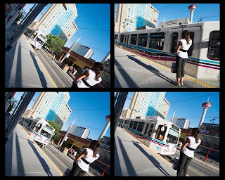
Four Quick Shots

Week 6

The Actionsampler is an inexpensive camera with 4 plastic lenses and a shutter mechanism that records pictures about 1/4 of a second apart on a standard frame of 35mm film. The camera is fixed focus, fixed aperture, and fixed shutter speed. Just point and push the button for four quick shots. The camera arranges the shots sequentially from upper left counter clockwise around to upper right.

To get this kind of shot with an SLR is easy but takes some post processing after the shot. Every shot should have the same exposure so I set my camera to manual ISO 200, aperture of f13, and shutter speed of 200. This is just one stop off the "sunny 16" rule and maybe I cheated a little because I used my meter and a test shot before shooting the series. I wanted depth of field and pretty fast shutter speed. Focal length is 16mm so very wide angle on full frame. It turns out the lag between shots I'd set for shooting speed when the shutter button is held down was 1/3 second instead of 1/4 second. It was late in the day - see the long shadows? - and the light was warm and dropping off a little. I cropped each frame to 8x10 after the shot. A D3 with a Nikkor 14-24 f2.8 makes for a pretty expensive Actionsampler but it does get the job done. Then it is just a matter of bringing all 4 pictures in as layers in Photoshop and pasting them in order.

When I made this series I was sitting on a bench waiting for trains to come by. I had done a couple of my patented "engineer style" shots where I held the camera perfectly level, nicely framed, nobody was in the shot, etc. Boring, boring, boring. So I came up with the idea of rotating the camera as I shot. Believe me, this type of creativity is difficult for an engineer. About that time the young lady came up and stood just in the frame. What luck! I like the way it is framed but there seems to be too much going on. See this shot in my blog for a more cropped and straightened version of the last frame: Apparently Random Travel Blog

I noticed after I had done this that it looked kind of cartoonish. You know, wacky angles and frames and what not. So I tried fooling around with the colors a bit in the shot below. I think the wide angle works well - might try a fisheye. You want the action coming at you I think but it would be worthwhile looking at it going away. I did something like this at Erica's wedding with the bouqet and garter toss sequences but at a right angle and with more frames. Kind of fun....

Idea based on Four Times More Fun, pages 42-43 in the book 50 Photo Projects, by Lee Frost
Cartoon or straight - which is better?


Saturday, July 18, 2009

Montage

Week 5

I'll bet you thought I'd never stop the black and white... but yes! Now it is green and white.

The idea here is that a collection of photographs can be more powerful than a single image. For my project I spent about 20 minutes on a walk from the house along the greenbelt in our neighborhood and photographed weeds, bushes, and trees that interested me with the preconceived notion of making a near monochromatic montage around the theme of leaves.

I fixed the aperture at 5.6 to reduce depth of field and let the camera choose shutter speed and ISO. Since it was late evening, most of the shutter speeds are 1/30 second and ISO is running 200 to 1000 or so. I might have chosen to shoot a little earlier and possibly get better light but this was guerilla photography and I was on a tight schedule. All shots were taken with a Nikon D3 (ISO 1000 is no problem) and a Nikkor 105 Macro VR so I could get close if wanted.

I've made montages before and posted them. See for example this one of cherry blossoms in Japan.

In all I took about 50 pictures. I selected the "best" and ran them through Photoshop to crop and get the resolution down. Cropping was random with respect to squares and rectangles - just whatever I thought might look good. On photos that were a bit "flat" I increased contrast and adjusted exposure with Levels. All processing was done on JPEGs.

Then I made a large blank canvas in Photoshop and sucked the pictures in as layers. I started in the middle and arranged the photos out roughly in a radial fashion in the same order I had imported them. The arrangement is supposed to look a bit like a leaf itself. I put a shadow under each photo and put a graduated green background behind it. There was too much yellow in some of the leaves to my eye (we have had a drought here) so I made a hue/saturation mask and reduced saturation in the yellows.

I gave it the very creative title of Suburban Leaves and stamped my name on it.

Idea based on Make a Montage, pages 72-73 in the book 50 Photo Projects, by Lee Frost

Monday, July 13, 2009

Toy Camera

Week 4

Inexpensive film cameras like the ultra low tech Chinese made Holga, about $35 new, are used by some for their sometimes unpredictable artistic effects. For my project I bought a $3.99 Winnie the Pooh camera at Walgreens that was pre-loaded with 35 mm 400 ASA color film.

The idea here is to free yourself from all the camera settings and expensive equipment. The Pooh has nothing to set at all. I have no idea what the aperture or shutter speed is. It is a pretty wide angle lens - I am guessing maybe 28mm or so. The lens is plastic, typical of this breed, and soft at best. At least the camera didn't leak light.

Anyway, out of a roll of 24 exposures (I actually had 27 when developed), this one was the best I thought. Click on it to enlarge and you can see how soft it is in corners. I didn't have to add vignette in Photoshop either.... I did convert it to black and white because I didn't care much for the color.

Just for fun, here I am shooting the Pooh on location at the Maroon Bells near Aspen, Colorado.

This is the shot from above with no Photoshop.

And here is a similar shot taken with a Nikon D3.

Idea based on Toy Story, pages 38-39 in the book 50 Photo Projects, by Lee Frost

Saturday, July 4, 2009

Shapes

Week 3

Once again I went back and forth on what to do this week. The photograph I finally selected was taken from the air as we flew back from Calgary. The flight path goes from Canada over the upper midwest of the United States and is spectacular in many areas.

I started by taking photographs of circular irrigation patterns but couldn't really make anything work. I ended up with this aerial of mountains and water but if you click on it and look in the top right hand corner you will see an irrigation circle.

What I like about it is the demonstration of chaos theory in the erosion of the mountains and the structure of the river (look up chaos theory if you don't believe me). These are shapes at their most sensuous and are present everywhere in nature. This shot of gardens in Papua New Guinea is another example of shapes from the air, although it is not cropped to accentuate the shapes.

The light comes from the early afternoon sun so the shadows aren't real long yet. I used my Nikon D3 with 70-300 mm VR Nikkor lens at 70mm, f5, ASA 800 in aperture priority to get a fast shutter speed of 1/2000. The airplane was at altitude, so maybe 30,000 feet. At this height you are shooting through a lot of atmosphere especially considering that it is not straight down. The moisture in air means it is blue and there is no contrast. I'm sticking with square and B&W this week for the format. I did everything I could think of to get contrast and used a green filter in the photoshop conversion.

Idea based on Shaping Up, pages 116-117 in the book 50 Photo Projects, by Lee Frost