Monday, January 25, 2010

Simplicity

Week 30

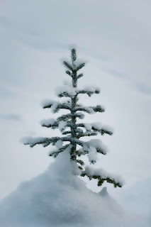
I have been looking for a good minimalist image for sometime now. It seems like it would be easy, but this is the first one I thought might be good enough to publish here.

The idea is to get rid of the clutter. Only retain what is necessary. Reduce shapes and color to a minimum and leave some space. No need for fancy lighting here.

This tree was poking out of about a meter or more of snow on the shoreline of Lake Louise. The lake is in the background, frozen over, and covered with snow. The texture in the background are old footprints from someone crossing the lake.

Technically taking the picture is easy. I'll give you the settings but it is seeing the picture that I find hard.

The camera is a Nikon D3 with an AF-S Nikkor 24-70mm 1:2.8G ED lens. The camera is in aperture preferred mode, auto focusing, and set at ISO 200. The lens is at f/2.8 to minimize depth of field and the camera chose 1/1000 of a second. I checked the histogram and had plenty of room top and bottom because of the cloudy conditions. Look at the very soft shadows and you'll see that the sun is behind the tree and a bit to the right.

Post consisted of a bit of color balancing to get rid of some but not all the blue cast and an exposure adjustment in camera raw. I smoothed the snow a bit with a blur in the background in Photoshop but left shading and the diagonal footprints.

Idea from Keep it Simple Stupid, pages 60-61 in the book 50 Photo Projects by Lee Frost.

Thursday, January 14, 2010

Just Forks

Week 29

Repetition. Patterns. It draws our attention. I probably don't use patterns enough in my photography now that I think of it. The idea here is that repeating features draw our attention, and we look for sense in it.

I was looking for something to photograph and the kitchen drawer came to mind. Just one fork wouldn't do so I picked five and arranged them carefully on a white paper background.

The trick with shiny things is lighting of course, and the light is overhead in a softbox, a single SB-600 in TTL mode with no exposure bias. I put white styrofoam on each side to assure even lighting.

The camera is my D3 at ASA 200 and 1/30 seconds. I wanted to push the exposure to the right to get the background white instead of grey (but not so far the blinkies showed up) so the exposure bias on camera is +1. The lens is a AF-S Micro Nikkor 105mm VR set at f/16.

Post consisted of cleaning up specks and spots - they really sow up in a close up of shiny things - and a crooked crop. That seemed to help the compositon a bit. I also tweaked it in curves to brighten the background a bit more without losing the shadows.

Idea based on Repeat after me, pages 100-101 in the book 50 Photo Projects by Lee Frost.

Sunday, January 3, 2010

It's All a Blur

Week 28

I like sharp photos. I normally don't like photos with blur unless it is subtle and showing movement (here is an exception). But this week's post is about intentional blur.

The blur can be for intentional softness, to show movement, or just to add interest as I've tried to do here. To get the blur you can set the shutter speed low, shake the camera, zoom it during the exposure, or pan it. You can add a foggy filter or just make it out of focus.

For this shot I moved the camera and added something a little extra - I set my flash to go off during the camera movement. Setting a slower shutter speed when using flash is also known as "dragging the shutter".

The cool thing about this is that the flash freezes things the instant it goes off due to the short duration. In my picture only the christmas lights hanging from the trees show the blur. The light was low enough that the tree, people, etc. weren't lit by ambient and showed up only when the flash went off.

The camera is a Nikon D3 in aperture priority at f/3.5 with ISO fixed at 400. Exposure was 1/5 second. The flash is a SB-600 in TTL mode so the camera was doing all the hard work. The lens is a AF-S Nikkor 24-70mm 1:2.8G ED zoomed all the way out to 24mm.

There is very little post processing. I cropped the shot and added a little contrast.

Idea based on Blur, Blur, Blur, pages 14-15 in the book 50 Photo Projects by Lee Frost.